Larry Weru’s Neutralized Election Map Challenges the Traditional Purple Map and Makes Reddit's Front Page
When the 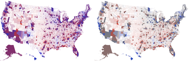 2012 Presidential Election data came out FSU Art ’14 Alum Larry Weru made maps to explore the data. In the process he stumbled upon a better way to display red-blue margins than the traditional Purple map, which he calls a Neutralizing map. This project utilized both computer programming and color theory to make a web-based, interactive 2012 election map.
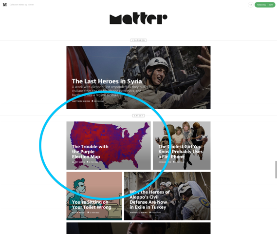
Recently he revisited the project and wrote an article about the Neutralizing map last Sunday. That article made it to the  front page of Reddit, with over 54,000 people taking a look at it and has been featured on Medium.com‘s “Matter” publication. The article also made the #1 spot on sidebar.io, a site that curates and features the 5 best design links of the day.
 For more information click here